These compositions are the result of an accident, in the midst of a calamity. I don't know if they are the start of a new way of working, or they're a one–and–done deal. Maybe, they're lame and I’ve wasted my time. I hope they’re not, and I hope I haven’t, but I remain unsure. With that said, I’ve still managed to concoct a smattering of thoughts on them. And, if all goes well, this endeavour will help me resolve some of them. If not, I hope you find the journey of the read interesting enough to warrant your stay.
In terms of structure, I’ve split this article into two sections. The first part lays out the chronological order of events – detailing how I made these artworks. For the second part, I’ve bundled sixteen months worth of thoughts and observations into a bunch of paragraphs.
Just so you know, both sections aims to be self-contained. Obviously, each section will overlap, but you should be able to skip one without getting lost in the other.
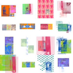 Figure 1: A batch of compositions, from the Ritherdon Compositions series.
Section One: Chronological Order of Events
The original plan was to make a photo essay, with two other people. COVID-19 stabbed that idea, but didn't kill it. I managed to create an essay of sorts, but it was on my own and watered down. You can see the photos here.
I haven't written anything about the photo essay (at the time of writing). So, I can't link to anything to explain the what, why, how and when. The short version is Nicola Ellis was completing her residency at Ritherdon and asked me to partake in creating a photo essay of the Ritherdon factory – with her and one other person. Unfortunately, I never actually met the other person, so I can’t tell you who it was. That was because, one significant aspect of the essay was we would all work separately. One of the main things Nicola pushed was her desire for each of us to have strengths in disciples different to each other. A by-product of this, as well as schedules, was the asynchronous nature of the workload. And, because the project was cancelled, I never got the chance to meet the other person.
Ritherdon, based in Darwen, UK, is a manufacturer of a variety of electrical enclosures and related products. One of its mainline products is the outdoor data and fibre cabinets, dotted around the UK. If you’re not from the UK, below (fig. 2) is a typical example of one.
 Figure 2: An example of an outdoor data and fibre cabinet.
On the days I got to go into Ritherdon’s factory, my approach was to just walk around and document things I found interesting. Of course, there was the health and safety stuff I was briefed on. But, for the most part, I was allowed to wonder around uninterrupted. Looking back, I’m impressed at how much trust Nicola had earned from the Ritherdon staff. And, I don’t think I would’ve had as much freedom as I did if it was someone else running the project. I should, also, note how welcoming Ritherdon’s staff were. I can’t see many companies being this accepting with letting in someone they barely know to take photos of their place of work. Like I said, looking back I’m impressed with the relationship Nicola and Ritherdon forged.
As I wondered around, I didn’t have a theme or type of picture I wanted to portray, or capture. My memory is a little fuzzy here, but I think my plan was to document stuff first and see what theme emerged. From there, I would make several more trips and focus on the types of shots which lent themselves to said theme. This was before COVID-19 came and cut my trips short. Fortunately, I had taken enough photos to potentially create some form of essay.
I’m going to stop talking about the photo essay now, because it’s out of scope for this article. From now on, the focus is on the making of the Ritherdon Compositions. Which began during the calamity called COVID-19.
I can’t remember which lock-down it was, but I stumbled onto the beginnings of these compositions whilst in the midst of them. Whilst editing one of the photos, I pressed the wrong key on my keyboard. This cause the image I was working on to have a sort of screen print look to it. At first, I thought ‘oops’ and began to undo my mistake. I then thought I actually quite like that. So, I saved a copy of the photo, in this accidental state, with the intention of coming back to it later. I can’t remember if I finished editing the photos for the essay before coming back to this, or I ended up working on both at the same time. Either way, both sets of work now exist.
The connection I made between the compositions and screen printing became important, quite quickly. And, the speed the connection was made at made it feel like an obvious and organic one. Thus, it felt natural to see resizing and layering each layer akin to lining up a stencil – like you doing whilst screen printing.
The stencil observation was significant because it was the springboard to seeing each photo/image as a form of paint brush. I could import an image onto a digital canvas and duplicate it – like applying a new coat of ink (or colour) over a used stencil. On top of that, the canvas doesn't have a one image limit. So, I could import several images and duplicate them all to various amounts. The images became elements, stamps and brush strokes for me to wield, orientate and compose.
Colour became significant after I started to treat images as elements. At first, I noticed basic colour theory stuff affected the composition as much, if not more, than the images selected. I, also, began noticing how numerous elements can merge (for lack of a better word) to form a new image. One way to think of it is an image is more akin to an atom and, when you layer/merge various images on top of each other, those atom-like structures start to establish new images/elements. From there, you can start placing various amounts of elements on top of the canvas. And, this recursive like nature made the colour aspect of the composition expand beyond its initial state. All of a sudden, I could build an element from atoms, with various shades of red. I could then offset that with an element made upon atoms with shades of orange/yellow (fig. 3).
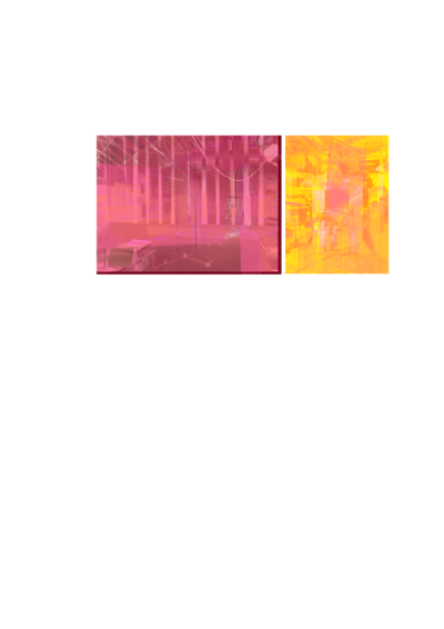 Figure 3: Composition 13 (part of Ritherdon Compositions)
The recursive nature of layering images/atoms to create an element meant I could keep going for as long as I saw fit. For example, one element could be built up from four atoms and another element from two atoms. Furthermore, I could create a composition from as many elements as the composition could handle. You can even use colour, again, to offset the various atoms in the same elements (fig. 4).
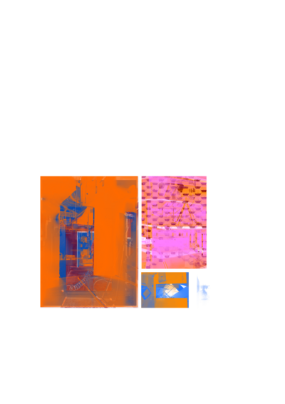 Figure 4: Composition 1 (part of Ritherdon Compositions)
Once I established the tools and framework described above, I began to play. At the time of writing, I have made forty-three compositions. Out of the forty-three, seventeen made the cut, and made it onto my website.
I’m going to start bringing this section to a close now. So, I will say the viewer’s position, in relation to were a composition is displayed, plays a significant part in the viewing experience. One of the observations I tried to build upon was the two-image effect. When viewed from far away, the geometric nature of the compositions is most prominent. It’s only when you get up close do you see the images within the geometry. So, whilst creating these compositions, I tried to balance the geometric image with the photo image. Each composition had to be one thing at five metres and another thing at fifty centimetres.
To, actually, bring this section to a close, I’ll say there is nothing special about the geometric nature of these compositions. It is a consequence of what felt like the most nature and obvious thing to do, whilst working on these compositions.
Section Two: Sixteen Months of Thoughts and Observations
I wrote this article in February 2024. My records say I completed the compositions in August 2022. That means approximately sixteen (+/- 1) months have passed since writing this and finishing them. Over that time, I’ve had several thoughts and observations develop. Some of them are stronger than others, but their all mine. I don’t expect to end this section with conclusive resolutions or revelatory insights. Instead, I hope to share my thoughts and hope some of them resonate with you.
For this next point, I will start be referring to a point I made at the start of this article.
‘I don't know if they are the start of a new way of working, with their own visual language, or they're a “one and done” deal.’
The reason for not knowing is based on the photos used for this series of compositions. There is nothing intrinsically linking Ritherdon to this style of work. So, that implies I should do more work, of this nature, using photographs of different subject-matter. By doing that, though, the geometric features of the work become the universal part of the work. The photo part is interchangeable and can be replaced on a whim. This dilutes the Ritherdon stuff considerably, to the point of making it practically irrelevant. Furthermore, if I make a new series with different images/photos, would it be building on what's already established, or retreading old ground? I think contextually, the new work would feel new. But, visually speaking, I think it'll look like a knock-off. The repeated use of geometric visuals will make the work feel like a remix of a song you already know.
The Ritherdon aspect of this work is relevant here because those photos (destined for the essay) are a necessary precursor to what this work became. I wouldn't have made this style of work without the accidental key press and calamity (COVID-19) which stemmed from these photos. There is an honesty to these works which captures a moment in time (and space if you include Ritherdon's factory). I made do with what I had within that time (and space). If I were to complete a new series, what images would I use? What binds the geometric visuals to the photo/image part? This is a question I cannot resolve. On the one hand, I think it shouldn't matter – just do the work and see what comes of it. On the other hand, the thought of doing another series makes me feel like I would be imitating myself – like I’m trying to recapture a moment from my past. There might be better images out there but my Ritherdon ones didn’t try to recapture a moment. They were the moment.
A slight tangent to that last point is a thought I had about ownership of images. If I were to create a new series, would I need to take the photos myself? For me, I think the answer is yes. There are certain limitations to the type of photo/image you can use and, personally, it’ll be quicker and easier to use my own stuff. Which leads me on to say, my answer is not a definitive ‘yes’, it’s a pragmatic one. I, also, think using other peoples images runs the risk of creating a re-stylised version of their work, which harks back to the point about listening to a remix.
On a different note, I’ve come to see these elements (I.E. merged/layered photos) as tools. Each element is stored on my computer as individual files. This allows me to drag-and-drop any element onto a digital canvas, which I can then mix-and-match with other elements – to form a composition. I didn’t make the connection at first, but I’ve come to see these pre-made elements like a brush pack, used in a digital art program (Photoshop being an obvious example). Which leads onto a slightly contradictory position: I’m okay with the idea of others using these ‘brush packs’ to create to their own compositions. I just don’t want to use theirs. (Insert awkward laugh here.)
One thing I like to think about is, what I call, the immediate visual. I haven’t written about it too much, but my article, titled Lawrence Weiner with Taken From the Wind & Bolted to the Ground, touches upon it. The quick version is it’s a term I use to help separate the visual features of a work from its conceptual underpinnings. I tend to use this term when talking about conceptual art, more than anything else. It helps explain my usual dislike for quite a lot of conceptual art, because of its requirement for prior knowledge of the work for it to make sense. Quite often, the immediate visual doesn't refer to the thing an artist is trying to reference or convey. So, as a viewer, you’re exposed to an artwork which is just a cryptic reference to something else. This frustrates me because all I have are the visuals of the work, more often than not. If the artwork’s immediate visuals are not core to the conceptual aspect of the work, the concept is going to go unnoticed, by most people. On top of that, I’ve found thinking in terms of the immediate visual as a good way to catch myself making runes. Thus, it gives me a chance to steer the work away from looking like one when I do. Which brings me back to the Ritherdon aspect of the compositions.
From an immediate visual point-of-view, most people (I assume) will find the Ritherdon aspect of the work a bit random. Because of this, I think these compositions ultimately fall flat, and probably fail. It, also, shows the work is mostly about the space between the viewer and the compositions, and how said compositions become spectra of detail – which the viewer can navigate through. Thus, we come back around to the notion of using other photos and creating more collections of compositions. I think, for now, the best course of action to take is to let this work be. I can always come back to it if/when I can resolve how to weave the subject-matter (of the photos/images) into the geometric (and spectra of detail) nature of the work, in a more cohesive manner.
To end on a more positive and conclusive note, these compositions are satisfying to look at, for me at least. I found it almost enjoyable to arrange the elements on the digital sheet of paper. The keyword, here, being ‘arrange’. I say this because the act of arranging the elements became a mixture of page layout and drawing. Which is something I’ve never really done, at least I can’t remember doing it. Usually, I draw (or receive) an image and add it to a page afterwards, as part of its layout. This time around, it’s almost as if the (page) layout is the drawing. Which is novel for me, to say the least. Maybe this novelty has clouded my judgement. Perhaps the idea of the (page) layout as the drawing is, in fact, the foundation of these works. Unfortunately, this particular thought arrived at the latter end of these past sixteen months. So, I’ve not had too much time to ponder it, but it does entice me. Nevertheless, I still feel unsure about committing to it. And with that, it looks like my attempt to end on a conclusive note hasn’t gone to plan. Oh well, I still think my compositions are satisfying to look at, and I hope you do to.
��������������������������������������������������������������������������������������������������������������������������������������