2011 was my first year in Manchester. I had no money and I destroyed all my
previous artworks -- before moving to Manchester. This left me with no direction
or momentum, two years out of university. I didn't think much of the photo's
below (fig. 1) when I first took them. They kinda got lost in the stuff I was
doing at the time. Which is ironic because I couldn't tell you what the other
stuff was now, eleven years later.
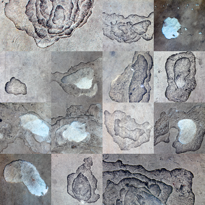 (Figure 1) Collage of the 'Pavements' series of photographs.
To see all of the 'Pavements' photographs, please click
here1.
Obviously, there are things I've forgotten but I do remember the core reasons
why I took the photographs. The main one was the 'Rule-Set' the pavements
naturally established. The other was my recent (at the time) inclusion with the
'Made in Liverpool' exhibition.
What are Rule-Sets?
I haven't written much about Rule-Sets in previous posts. So, now is a good time
to go over them. A Rule-Set is a collection of rules I must abide by when making
an artwork. They became a major part of the work I produced whilst at
university. I haven't used them too much since then -- at least in a significant
way. They usually appear or I notice them after working on a series for a
while. I sometimes keep the restrictions in-place after I've noticed them, as a
way to keep it interesting, but I don't put them front and centre. An example of
what a Rule-Set usually looks like is as follows:
- Each artwork must consist of two pieces of paper.
- Each piece of paper must be folded no more than two times.
- Each piece of paper must be A4 in size.
- Both pieces of paper must be a different colour to each other.
With these constraints in place, I would get to work. Whilst at university, the
Rule-Sets became the premise for each artwork I made. Each piece was a result of
me sticking to the Rule-Set and, as a consequence, I tended to neglect the
viewers experience. In other words, the artworks were not allowed to be the
focal point of the viewers experience -- the Rule-Sets were. This meant the
artworks looked a bit lost if the viewer didn't know about them. It was this
observation which caused me to reduce my reliance on them. I now use them as a
tool and let the artworks become their own thing.
Regarding the 'Pavements' photographs, I found it quite natural to keep each
image constrained to a single paving slab. Each photo I took had to frame the
image within the confines of the concrete borders, of each slab. This
constraint/Rule-Set kept me focused but I didn't want this constraint to be a
hard pre-requisite for the viewer. The images needed to be interesting to the
viewer without them knowing about any Rule-Sets. At the time, I didn't think the
photo's got passed that which lead me to not viewing them in high regard. I
began to notice the 'space'2
aspect of them over time, though.
As I said at the start, I didn't think much of the photo's. What won me over,
though, was the effect of the positioning of these 'features' within the frame
of the slab. I took the photographs by assessing each image from within the
concrete frame provided by each paving slab. I then expanded on the idea of the
'frame' when I started cropping the images, back at home. Depending on how I
cropped the image, I either felt a sense of satisfying correctness or not
(fig. 2). Where the 'feature' within the image lay became important but it was
not immediately correct or obvious, where the 'feature' should sit. This lead to
further interest and expansion into other types of images and media but that
came after 2011.
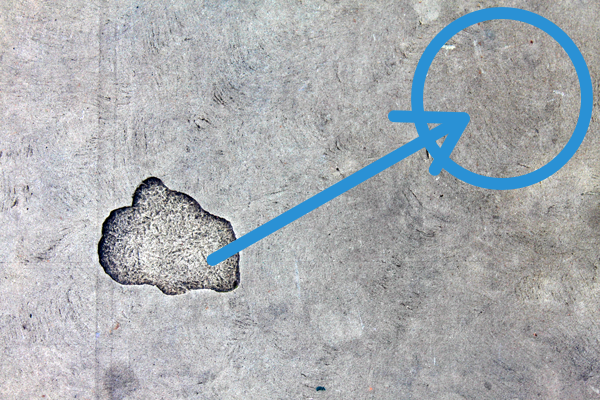 (Figure 2) The image would feel incorrect if the 'feature' was place in the blue
circle.
(Figure 2) The image would feel incorrect if the 'feature' was place in the blue
circle.
I admit, how you arrange/compose an image affects how it's viewed is not a
ground breaking observation. If anything, I already knew it. We, as humans,
understand this intuitively. We all know if something sits nicely or not. A dot
on a piece of paper sits betters in some places and worse in others. This how
and where something occupies a space became my direction and I slowly built
momentum whilst heading in that direction.
About the 'Made in Liverpool' Exhibition
'Made in Liverpool' was an architecture-based exhibition 'exploring the future
of Liverpool's built environment' and I helped curate the exhibition.
Whilst putting the show together, I came across a lot of three-dimensional
elevations like the image below (fig. 3).
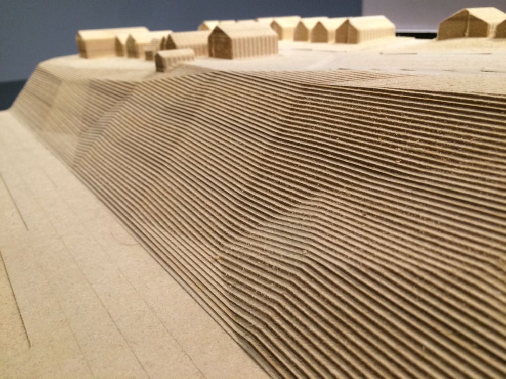 (Figure 3) The layers of MDF stacked on top of one another to form the elevation
was still prominent in my head when I took the 'Pavements' photographs.
(Figure 3) The layers of MDF stacked on top of one another to form the elevation
was still prominent in my head when I took the 'Pavements' photographs.
Note: More examples like the image about can be found
here3.
Looking at the example (fig. 3) above, hopefully, you can see the similarities
between it and the images in the 'Pavements' photographs. The most notable part
being the layered elevations in the architect model and the broken sections in
the 'Pavements' photo's. With that said, I like the opposite nature between the
pavements and the models. The models derive their form by adding layers. The
'images' in the pavements come into existence by removing layers.
It was here when I began to start forming 'Space as a Starting-Point' as a
conceptual framework to build from. I didn't recognise it at the time but the
vertical nature of the 'images' in the pavements started to grow on me. The
images were not surface-level (like a traditional two-dimensional images). They
had to be scooped out and the eye had to peer in, not on. On top of that,
I did quite a lot of sculpture work in university and the extra dimension in
these images helped bridge a natural connection from that time to 2011. With
that said, I wouldn't be able to articulate that in 2011.
I titled this post 'The Presence of Absence' which sounds a bit like a title for
a straight-to-DVD James Bond movie. It, also, alludes to the nature of the
images within the pavements. They are there because parts of the pavements are
no longer there. They are absent which leads to an interesting question: Is the
image what's left or taken away? I'm guessing some will say it's what's left,
others will say the opposite and the rest will say it's a combination of the
two. Regardless of where you stand, this observation helped me move away from
seeing the photograph's main feature as the Rule-Set. The viewer doesn't need
prepping to see the work 'as intended'. The removal of the material is apparent
in the image. The viewer can see (or not see it).
The title of this post, also, alludes to a path not taken. Having written this,
I now realise I had two potential paths to walk down. I could have focused on
the 'space' aspect or the 'presence of absence' (I.E. the removal of material
and/or the negative image). I don't remember why I headed in the direction of
'space' but I think the 'presence of absence' aspect was something I couldn't
articulate to myself as easily as the 'space' premise. I, also, think I
struggled to separate the two premises and I muddled my thinking into viewing
the photo's as artworks about 'negative space'. On top of that, I think Rachael
Whiteread's4
sculptures of negative space where lurking in my head and I felt like this was
an already well trodden area. So, I kinda focused more on the 'space' part and
dropped the 'negative' part. It's been a while, though, and I've simply
forgotten most of what I was thinking at the time. All I do remember is the
'space' premise stuck around and it's the direction I've been heading in since
then.
Links
- 'Pavements' (Complete Series)
- Craig's Practice Statement (2018)
(alludes to 'space' in my practice)
- Architecture Models
(Pinterest)
- Rachael Whiteread
(Wikipedia Article)